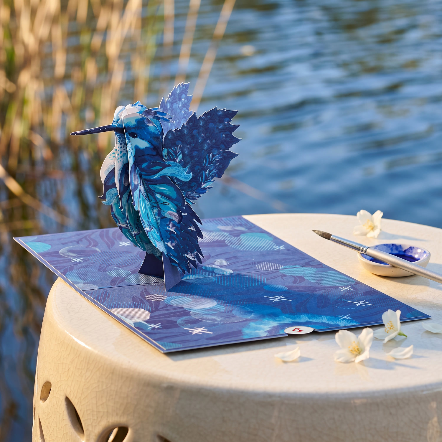
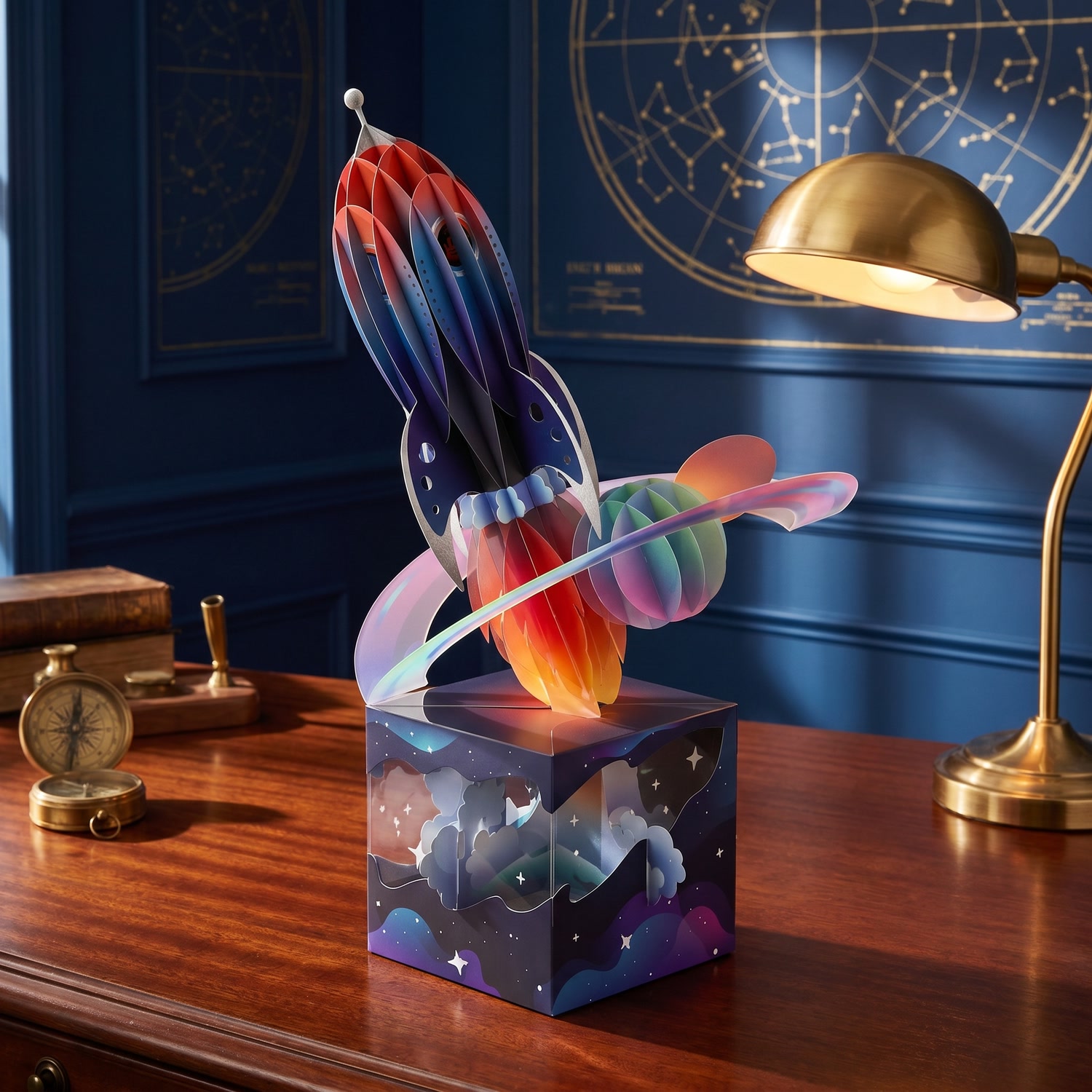
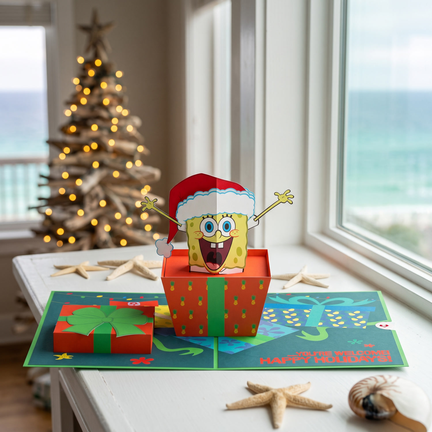
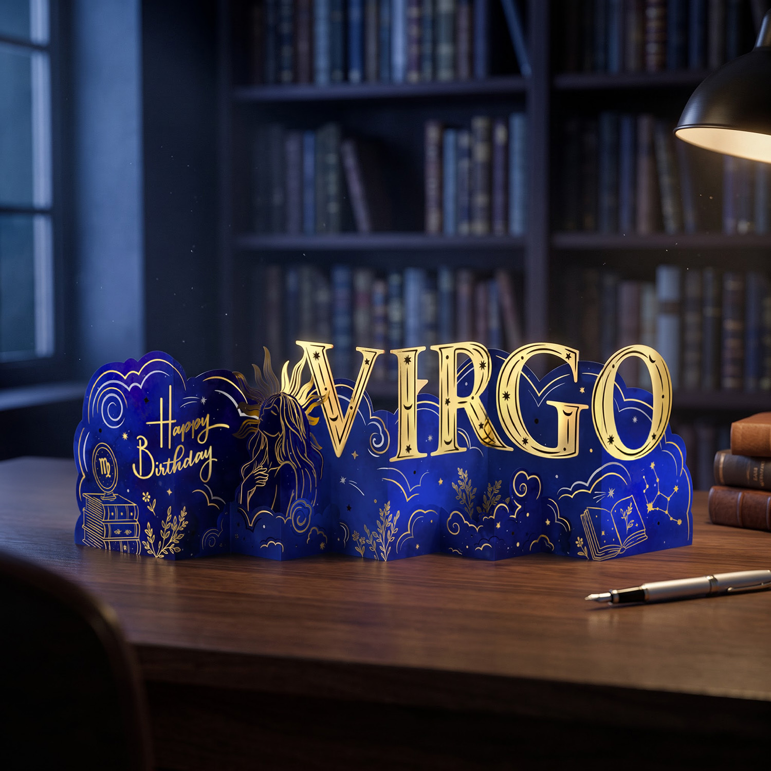
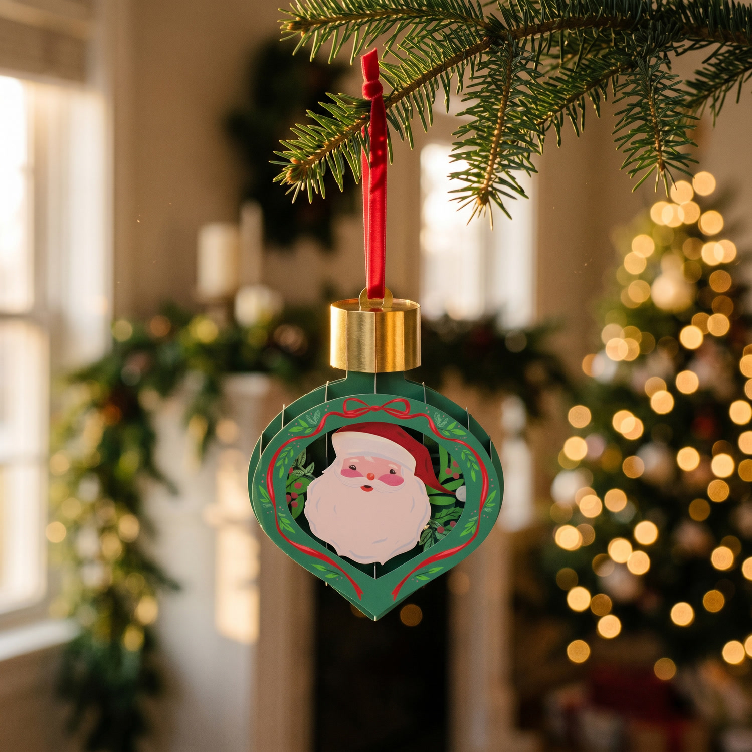
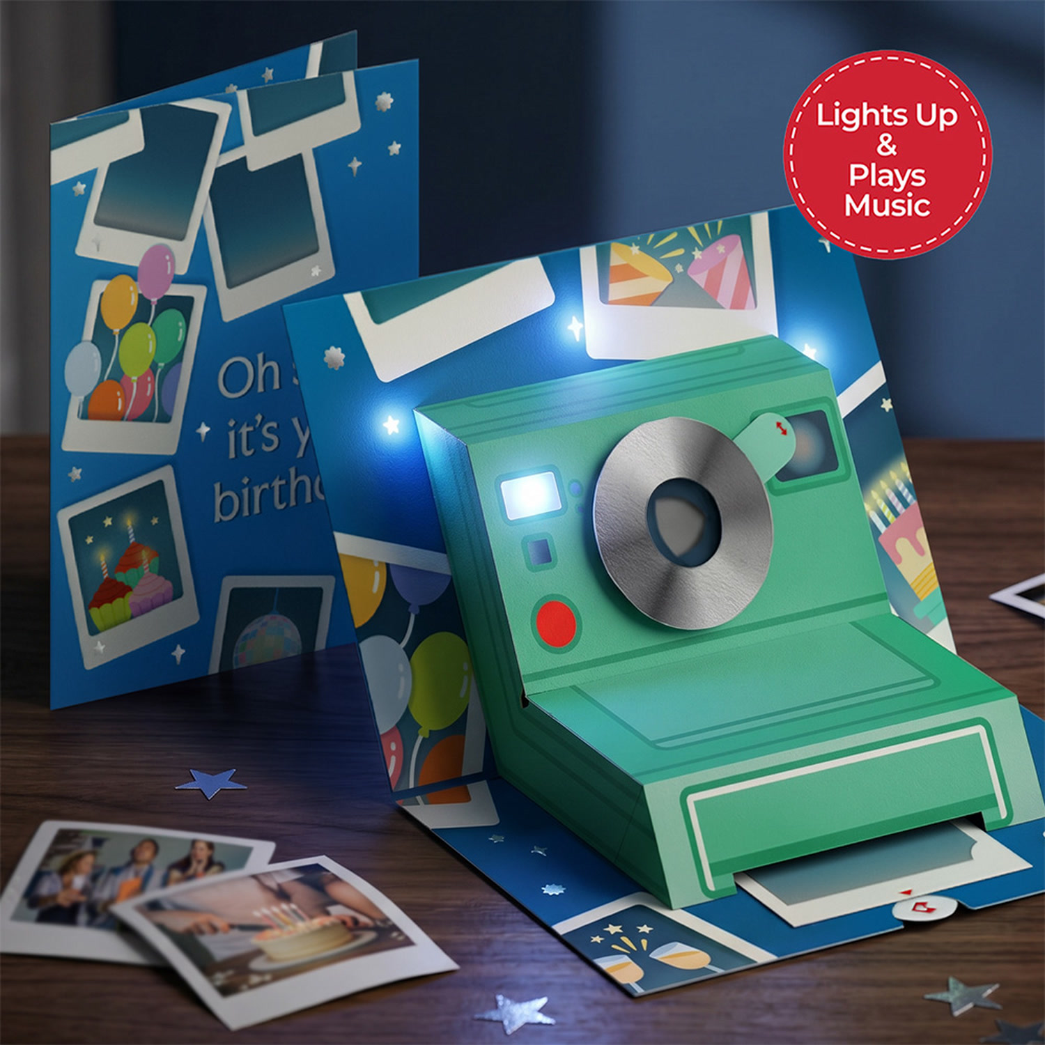
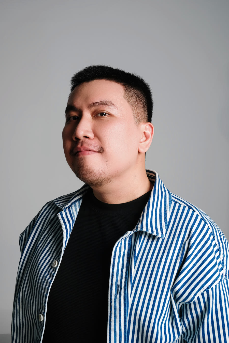
13 years in design and commercial photography. Since late 2024, all of it aimed at one problem: running a generative pipeline for a paper-craft catalogue.
Concept, art direction, generation, retouch, final cut.
Every frame on this page, one person.
Written, art-directed, generated and cut end to end. Every one shipped as a live ad with a hook, a product beat, a call to action and a brand endcard. None of them are test renders.
Creepiest greetingsA night greenhouse, a carnivorous paper flower, a lens moving across the petals.
18s · Nano Banana + Kling
Jack the Papercraft DJA paper robot headlines Times Square, then folds back into a birthday card.
18s · character-consistent
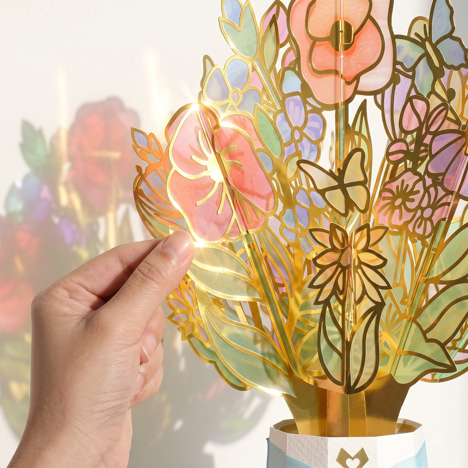
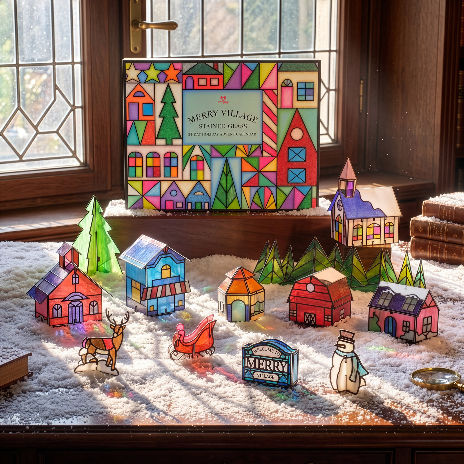
Suncatcher CardsLight passing through stained-glass paper, throwing the pattern across the table. That effect is the entire selling point.
25s · B+E launch
Golden Patriotic EagleA paper eagle over a paper city, then fireworks over the harbour. Built for a 250th anniversary.
15s · seasonal campaign
Halloween, but make it catLongest cut in the set. 3 product beats, 1 audience, and a joke held the whole way through.
35s · Halloween core
Petal Pressed bookmarksStraight commercial structure: hook, 3 beauty beats, 1 line of copy, endcard.
28s · seasonal launch
Possum, texture cutMacro on paper cheese, closing on two possums folded into a heart card.
17s · direction A
Possum, narrative cutSame character, same product, slower and character-led. 2 options, 1 brief.
14s · direction B
Hover to play · click for sound
Both clips are the same paper robot. 5 seconds apart in runtime, an entire production apart in what they do.
Locked camera, white cyclorama, a character dancing to nothing. Clean enough technically, and useless commercially.
Same character, given a stage, a line, and a brand to carry. Shot at 4K for retail screens.
A model can hand you a subject. Turning it into an advertisement is still the part you do yourself.
The hard part is never the first image. It is the last one of a long season, still looking like it came from the same studio, still reading as paper rather than plastic. Prompt structure locked per product family, then upscale, colour match, deliver.


Click any frame to enlarge
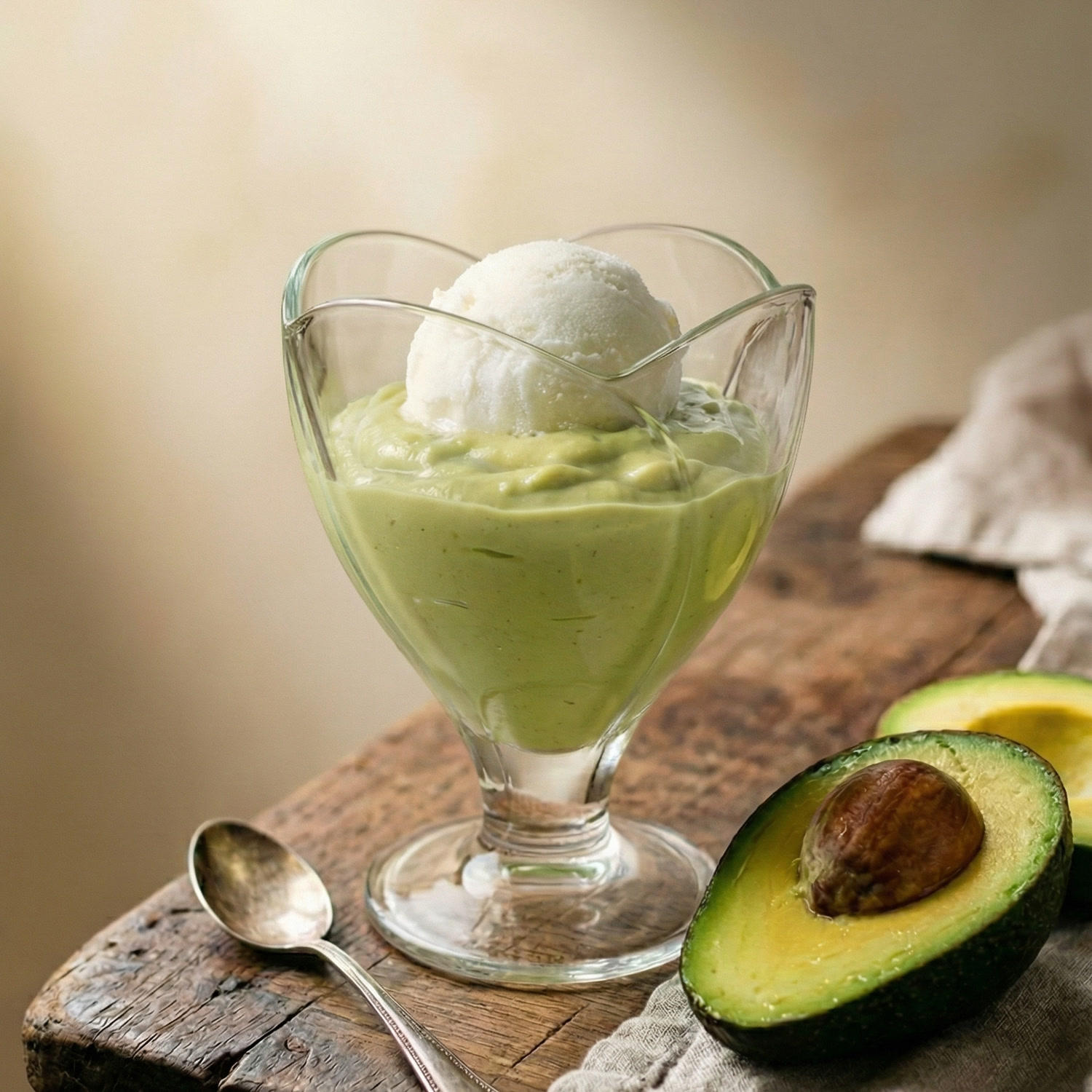
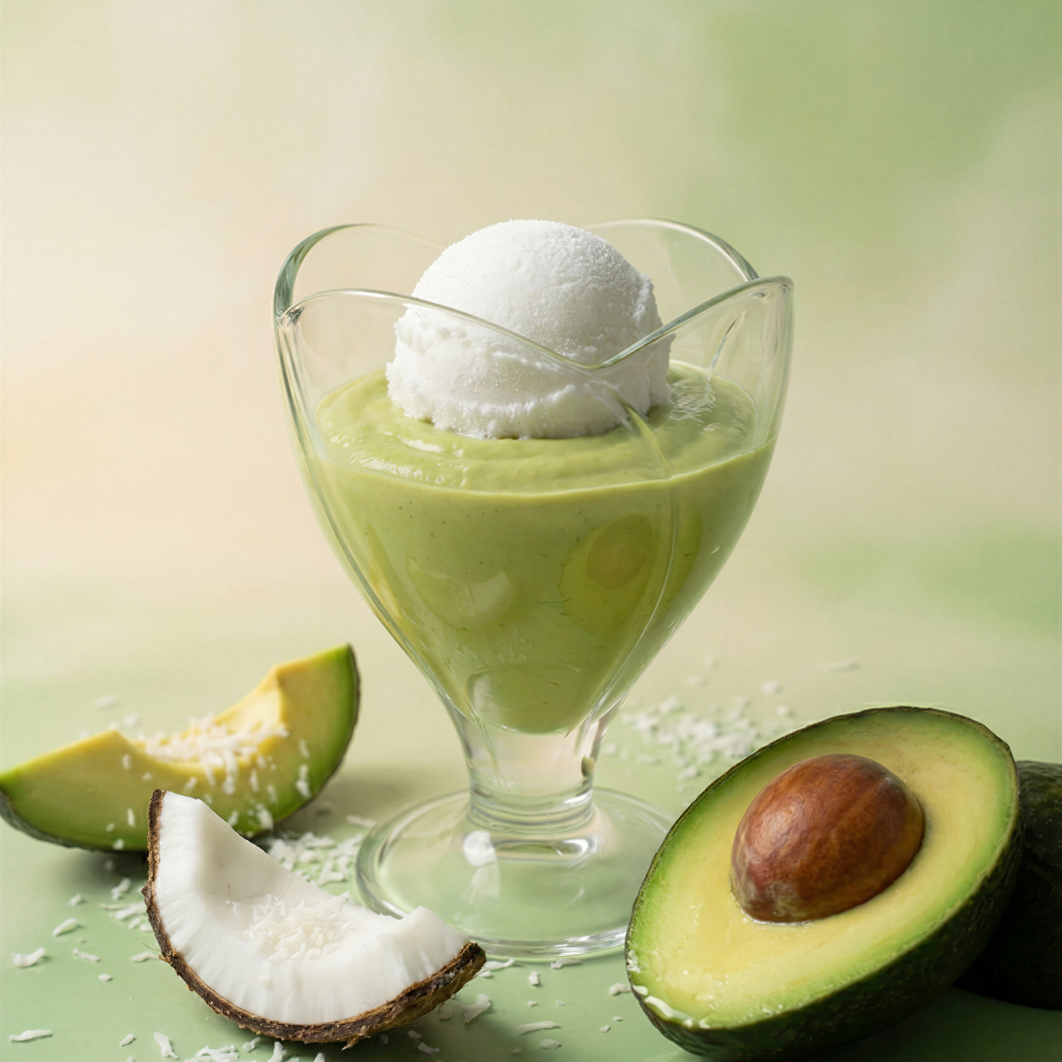
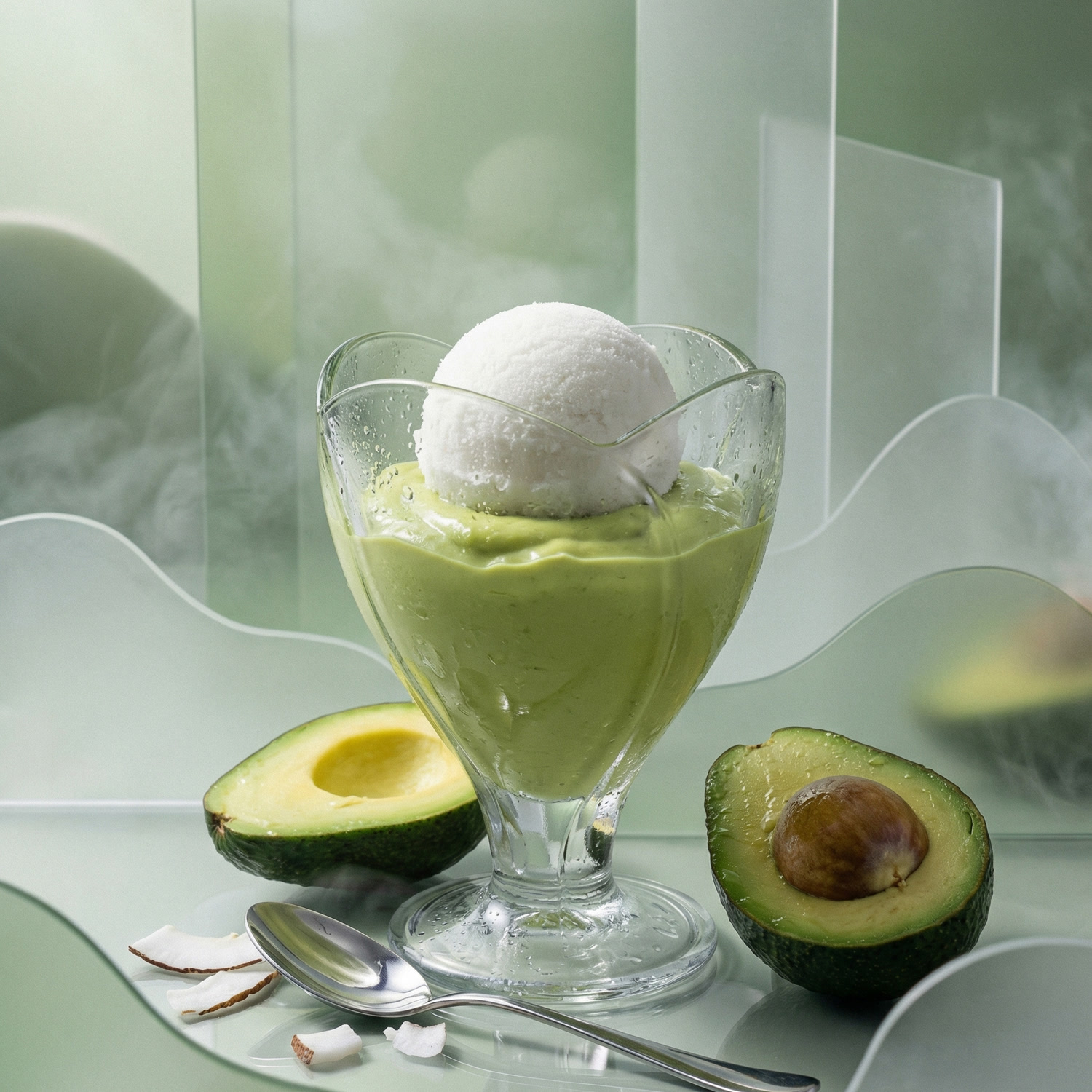
The same dessert, the same glass, the same scoop. What changes is the argument each frame makes about who it is for. Each version takes minutes instead of another shoot day.

RusticWeathered wood, linen, a tarnished spoon. Warm and domestic, the version that reads as homemade.

CommercialClean green ground, ingredients laid in as proof. Bright, legible at thumbnail size, built for a menu or a listing.

EditorialFrosted panels, condensation, cool mint palette. Colder and more designed. This is the campaign version rather than the catalogue one.
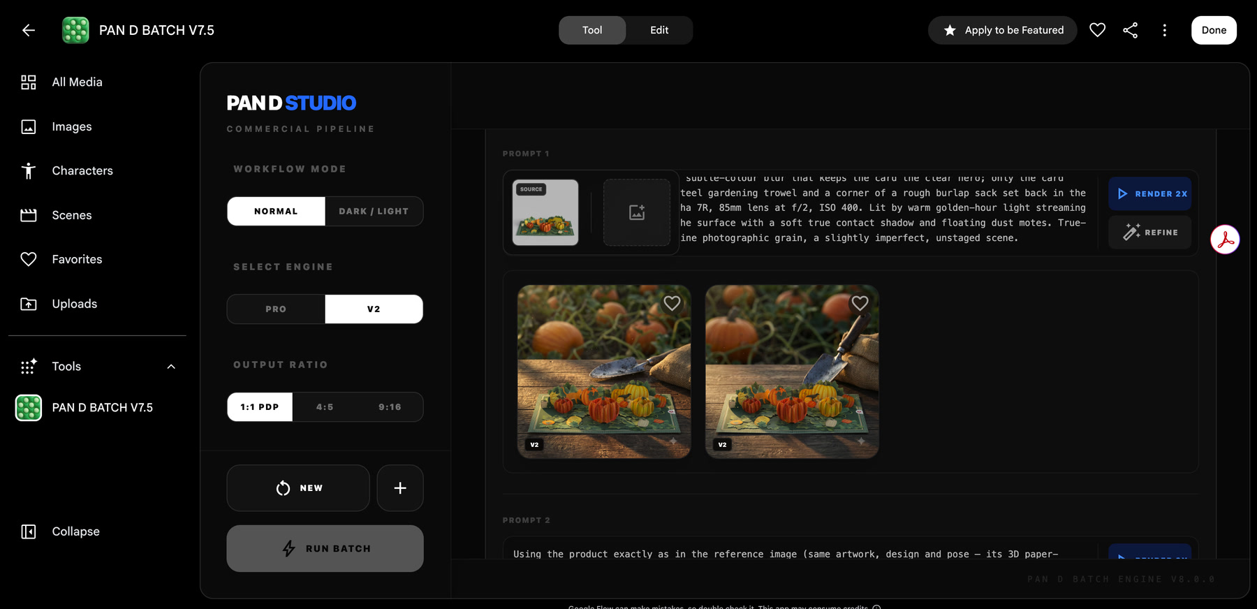
Generating product images one at a time is fine until you need sixty. So I built the thing that runs them as a set. PAN D BATCH, now on engine v8, written as a single-file React app on Google Flow SDK.
The ratio switch is the whole point: 1:1 for the product page, 4:5 for feed, 9:16 for stories. One run, three crops, no re-shoot and no re-prompting.
Look at the prompt text: 85mm at f/2, ISO 400, warm golden-hour light, a soft true contact shadow. Twelve years on real sets is what makes that specific instead of vague.
Every prompt after the first one locks the reference: same artwork, same design, same pose. That constraint is what turns a pile of nice renders into a usable catalogue.
13 years of real sets: real lights, real clients, real call sheets. That archive is the reason the AI work holds up. A prompt asking for soft window light from camera left, one stop under on the background, is a lighting diagram I have physically built.
Scroll sideways · each card opens the project on Behance

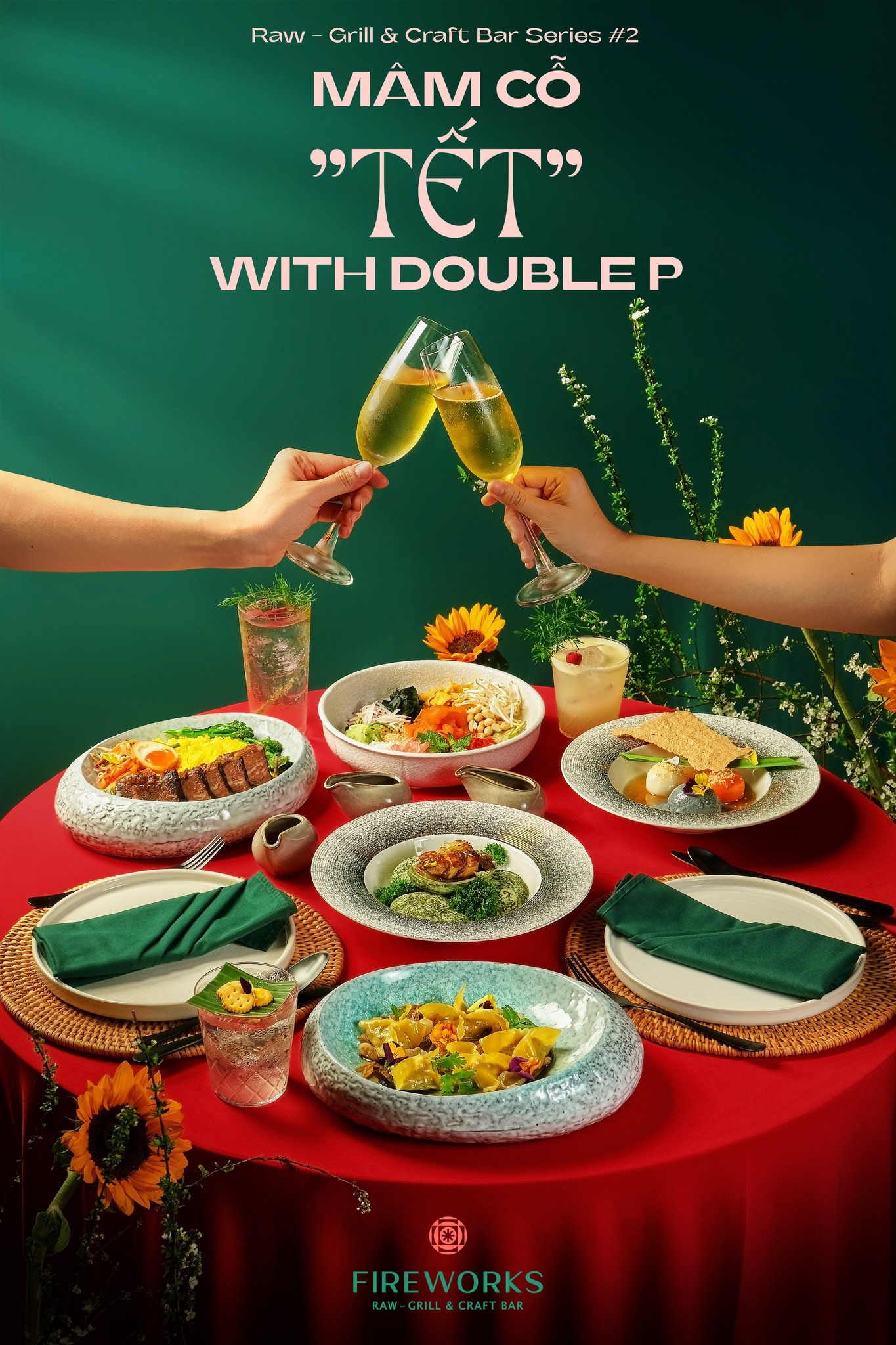
FIREWORKS Raw · Mâm Cỗ TếtDeep green ground against a red cloth, two hands meeting in a toast above the table. Sunflowers and apricot branches carry the holiday without spelling it out.Art direction · styling · photography

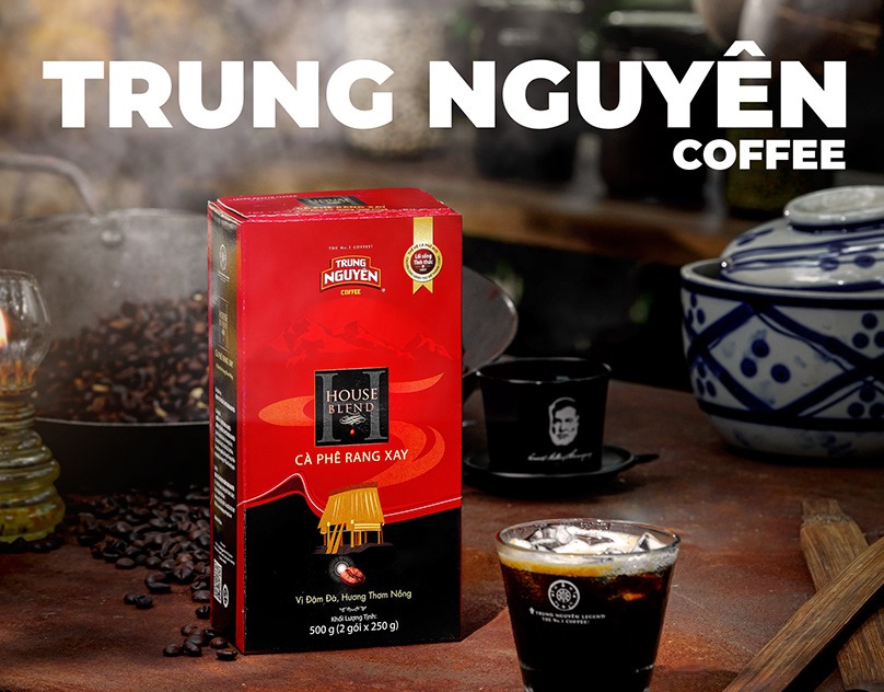
Trung Nguyên CoffeePackaging as hero on a working kitchen set: roasting pan, oil lamp, blue-and-white porcelain. Hard key from the left, deep falloff behind.Art direction · styling · retouch

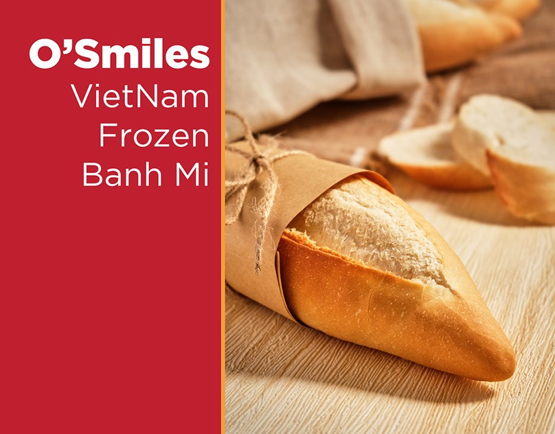
O'Smiles · Vietnam Frozen Bánh MìAn export product that had to read as fresh bread. Kraft paper, twine, warm side light to bring out the crust.Art direction · styling · photography

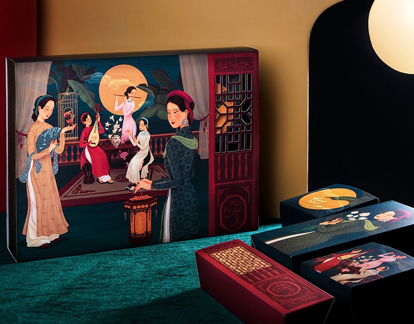
Bự Bakery, Mooncake 2020Illustrated boxes on teal velvet, a lit disc standing in for the moon. The set is built so the artwork on the lid stays the subject.Art direction · styling · photography

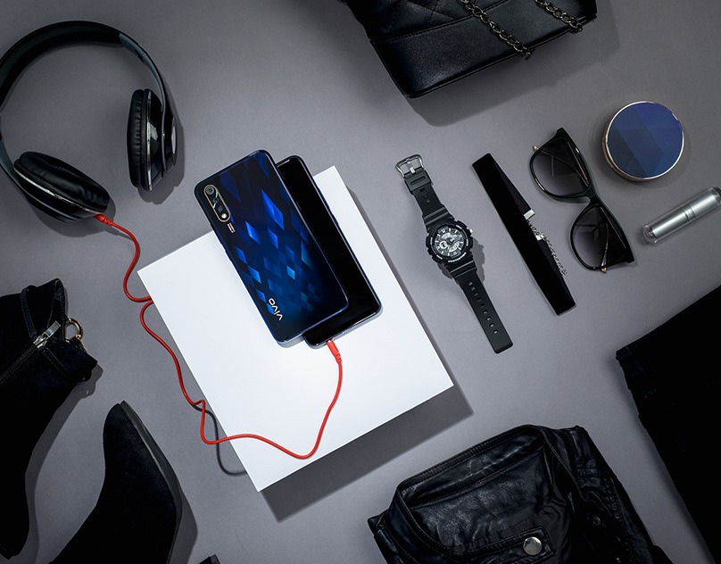
VIVO S1Everything on the set is black or grey except one red cable. The phone sits on a raised white card so it lifts off the surface instead of sinking into it.Art direction · styling · photography

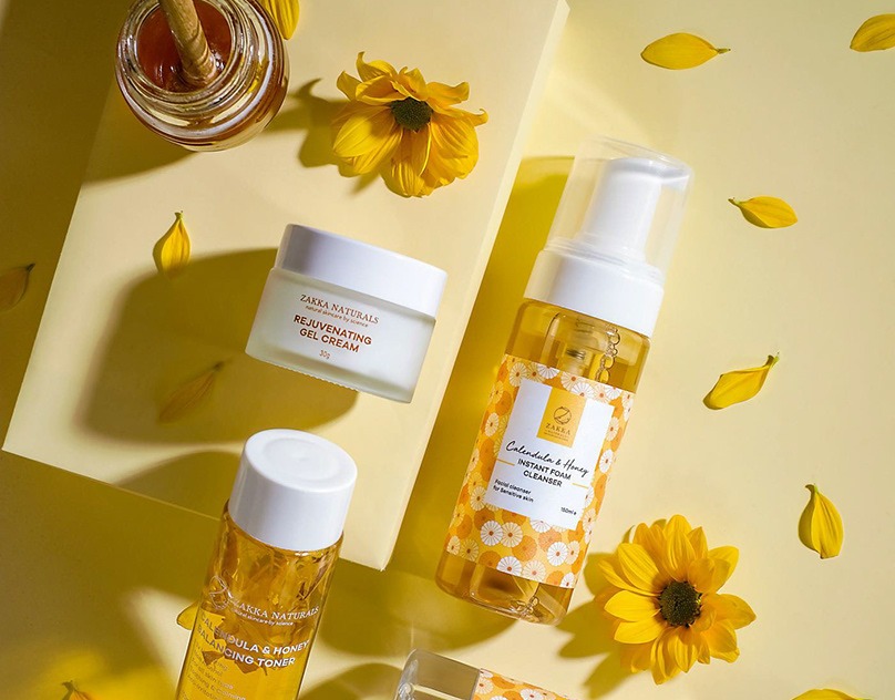
Zakka Naturals · Calendula & HoneyYellow on yellow, with the honey dipper and loose petals doing the ingredient work. Hard sun raking across to keep the shadows crisp.Art direction · styling · photography
13 years across graphic design, commercial photography and now generative production. The through line is the same: put the light where the story needs it.

This site was designed and built
by me, with AI as the pair.
Hand-written HTML, CSS and JS.
No template, no page builder,
no framework.
AI product photography and short-form film for a paper-craft catalogue. Concept, art direction, generation, retouch and final cut, solo.
Commercial product, food and cosmetics. Styling and concept art, plus events, interiors and editorial.
Product imagery and design for one of Vietnam's largest cross-border sellers on Amazon, Walmart and Wayfair. Fitness and outdoor lines, shot to survive the marketplace thumbnail.
Posters, brochures, e-commerce landing pages and social campaigns.
Social media planning, shooting and design.
Menus, infographics and product photography. Offline events.